No Delete Button and a Heavy Soul.
You can always spot something made by a person who understands their craft: a drawing, a piece of furniture, a logo. There is no undo key, just skill, care and commitment.
Somehow, a part of that person is in there; you can feel the difference. The spacing, the understanding of form. The use of light and shadow.
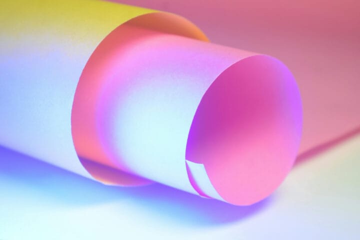
The same is true of graphic design and printing. I don’t mean soul-sucking digital vanilla; I mean proper print, hot foil printing and letterpress printing the kind that fills a hole in your heart you didn’t know was there.
It all starts with the materials.
I was saying to Tracey yesterday — Most people treat paper like it’s an afterthought. They can spend forty hours pushing pixels around a screen, obsessing over a millimetre and a hex code that doesn’t really exist, but the paper is glaring white and smooth as a baby’s bottom. No variation. No thought. No care.
It’s like asking a Savile Row tailor to cut a bespoke suit out of a £1 roll of bin liners.
I guess it’s a confidence thing. A fear of colouring outside the lines. Everyone talks about “telling a story” and “branding,” but most are saying and doing the same thing. No one seems to want to stand out, not really. They play it safe in the comfort zone of the screen, settling for the easy answer served on a plate. It comes in a box of 500 from a bish-bash-bosh online print shop, and that’s good enough, I guess.
But to be honest, it does my head in.
There is so much choice out there. I’ve seen the same run-of-the-mill, bog-standard white, super smooth sheet so many times that I now see it in my sleep. God help me.
Everything should start with the paper.
Paper is the canvas. There are thousands of colours and textures waiting to set the tone and mood for your work. Choosing the same stock as everyone else actually means you have nothing different to say, but it doesn’t have to be that way.
Order samples. Ask questions. Anyone who gives a damn about the craft will light up. I know I do.
Finding someone who actually cares about paper? That’s a unicorn in a field of donkeys.
Hey, I get it. A lot of it comes down to budget. But some of it is just accepting what other people give you; some might even say it’s the lazy answer. (Obviously, I would never say that.)
Designing for the kind of work I do is totally different to designing for a screen. On screen, you can layer solids and gradients with a click, knowing the undo button is there. But when you move from digital to the strike, it isn’t that simple.
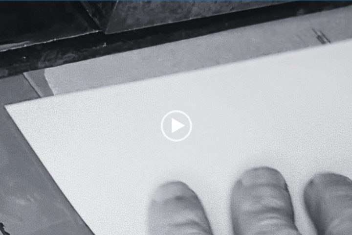
When the metal die hits the stock at 180°C, it’s a violent act. A permanent mark. There is no Cmd + Z. No delete button.
In print, especially with hot foil printing and letterpress printing, you have to know what you are doing. Less is more, and the “feeling” comes from the stock and the depth of the impression rather than adding flashy soulless stock graphics just for the sake of it.
But choose the right paper, the right font, the right colours, with spacing that’s a perfect union. I would argue with any doubting Thomas, any day of the week, that when you get it right, it is nothing short of art.
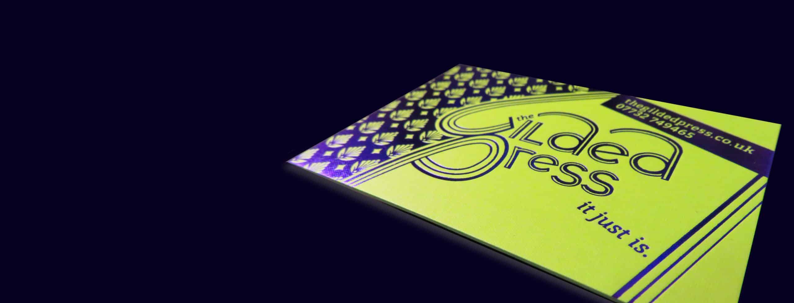
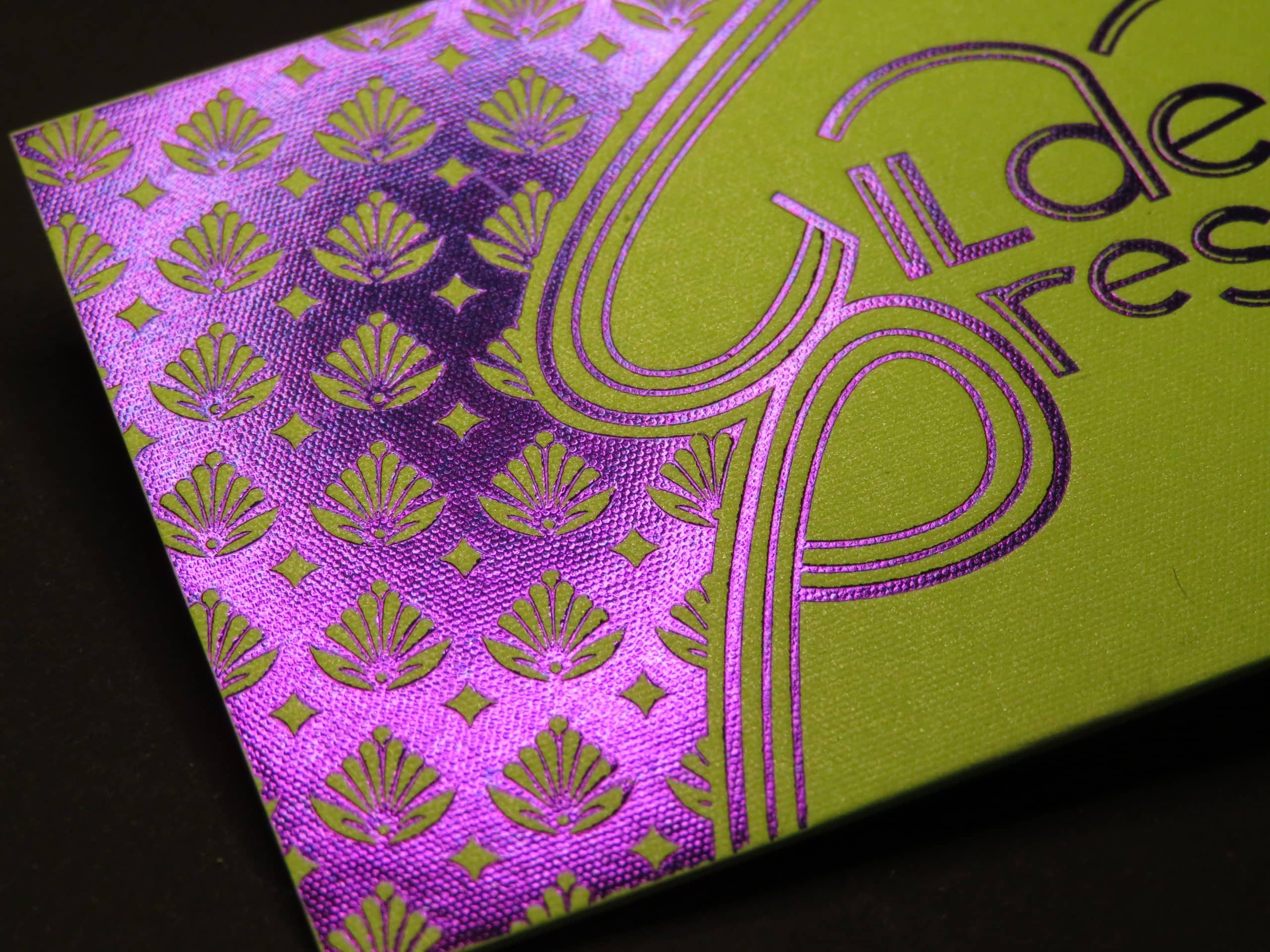
You see, real paper has character because it’s made properly. You can see and feel the difference; it speaks for itself, and you get those lovely, firm edges that create the shadow and depth we are looking for. And that depth of colour, a sign that someone didn’t just take the first option because they were dying to go home, but actually cared.
On the mass-produced super-smooth, clay-coated nonsense, the foil just sits on the surface like a cheap sticker. No depth. No thought. No soul. Another piece of print destined for the bin.
If you want a sneak peek into the world of real paper, then I’ve put together a list of the merchants and mills that still understand that paper is a craft, not a commodity. I call it the Gilded Ledger. Click the link below, and I will send it to you today. No strings attached. No 20,000 spam emails, because I know how annoying that is.
It’s one email straight from me to you — Join the fight for the love of paper and the love of print.
Simon, Proprietor, Pulling levers since 1987.
The Gilded Press, a hot foil and letterpress studio in Eastbourne, East Sussex, England.
Download The Gilded Press Paper Ledger
The paper suppliers who still give a damn.