The world doesn’t need more “stuff.” It needs more substance.
Most of the designs landing on my bench lately are beautiful. Truly. You can see the hours spent pixel shifting and the thoughtful palettes used.
But the truth is it’s a life lived on a screen, and we’ve got used to the easy answer. I guess it’s the path of least resistance. A click of a button, job done and “that will do.” Kerching! Money in the bank. But a life of “premium” white smooth as a baby’s bottom card has as much soul as a 10p bag-for-life.
If you’re okay with your work being part of the “Digital Landfill,” stop reading now. This isn’t for you. But if you think your design actually deserves more, then listen up.
Everything starts with the paper.
As I said to Tracey, “You can have the best design in the world, but if you slap it on bog standard white smooth as a baby’s bottom stock (you know the kind I’m talking about), then you have wasted your time, because anyone can do that, but as long as the invoice is paid, who cares, right?”
Well, I do. And if you’re reading this, you probably do too.
It’s always the same suppliers, the same smooth, bland sheets passing as “premium.” Paper choice isn’t about “that will do”. It’s about whether the paper is an essential part of the work: if you take it away or change it, does it say something else, or is it just something you added because it’s cheap and easy, like ketchup on your chips?
The Death of Tactility
I’ve been printing long enough to remember when paper had character—when it had a grain and “tooth” that fought back.
These days, the industry is obsessed with “Digital Vanilla.” Paper that is perfectly flat, perfectly predictable, never touched by human hand and perfectly boring.
It’s paper designed by a committee for a machine that speaks in 1’s and 0’s. Most of the good stuff is hidden away now, buried in the back of sample books, forgotten.


Why I’m Sharing the Ledger
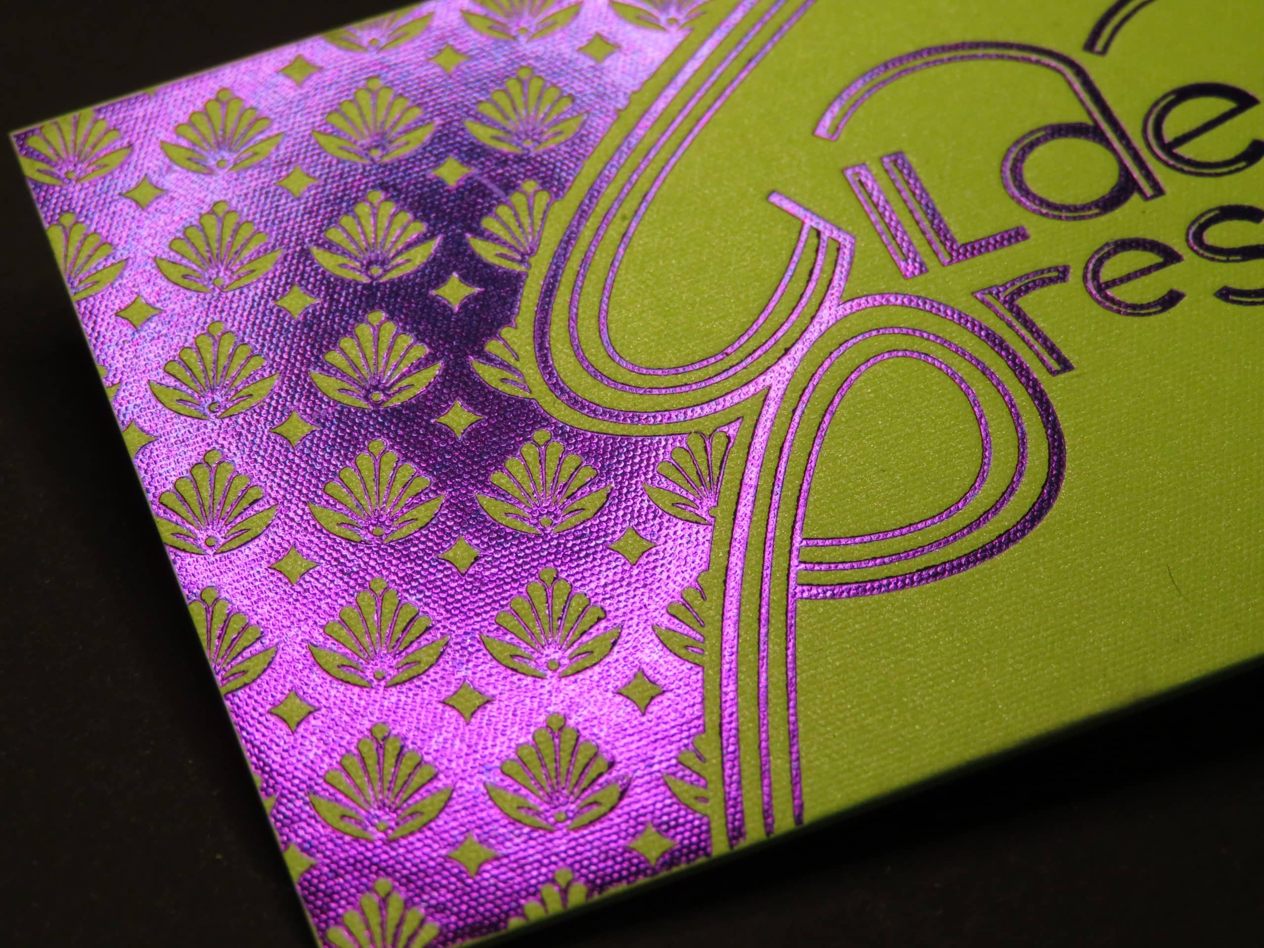
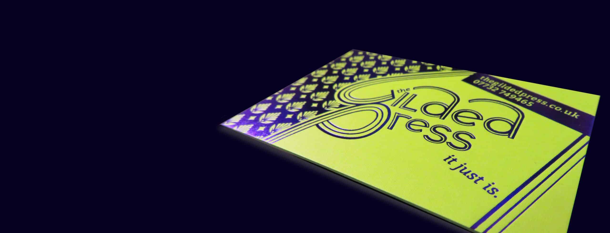
When I’m standing at Old Red, I don’t just “print.” I press. I’m forcing gold foil into the very fibres of a heavyweight board at 180°C. You can’t get a Deep Impression on a sheet with the structural integrity of a Hobnob biscuit that’s been dunked too long.
So, I’ve put together a list. This isn’t some cookie-cutter round-up or “Top 5” clickbait nonsense. These are merchants and mills who still understand that paper is a craft.
- The Heavyweights: The ones who still make 700gsm boards that feel like a slab of slate.
- The Specialist Mills: The ones tucked away in the Lake District or the Italian hills who still know their stock by feel.
- The Grains: Why I choose certain fibres for a deep brass die strike and ignore others.
No Kickbacks. Just Craft.
This isn’t a thinly-veiled sales pitch. There are no affiliate links, no “sponsored recommendations,” and I’m not getting a penny if you visit them.
It’s just a grumpy old git who still gives a damn sharing his contacts because the best materials make the best work.
If you want to make something memorable, something that feels complete and actually says something, it starts with the paper. It always has, and it always will.
Get The Gilded Press Paper Supplier Ledger.
I’ve curated a ledger for the ragtag rebels who are tired of bright white super-smooth boring nonsense and want something with substance.
Hey, the “bish-bash-bosh” print shops more than likely don’t use these suppliers. The stock is not always easy to print on, but the path least travelled never is.
Have a look. Order some samples. Feel the weight. The finish. Or don’t, the choice is yours, just don’t be disappointed when your next project looks and feels like every other piece of digital landfill.
Simon, Proprietor, The Gilded Press (hot foil stamping by someone who still gives a damn).
P.S. Once you’ve seen the list, order Firebrand Box No. 4.